フェデリコ・デルロッソ氏(建築家)
Federico Delrosso, Architect
– EUROLUCEを視察するポイントを教えて下さい。
ミラノサローネの一環として行われるイベントであり、2年に1度という貴重なタイミングで、EUROCUCINAと交互に行われますが、今年も多くの建築家やデザイナーといったプロフェッショナルが集まる、非常に期待値の高い光の展示会です。
光は、建築において本質的で、魅惑的なエレメントです。日中の時間帯は自然光を取り入れながら生活していますが、夜間は、人工光を使うことで同じように生活を続けることができます。非常に特殊で、繊細で、便利で、魅惑的という重要な要素が、光であると考えています。
– Could you give us some useful tips on how to view EUROLUCE?
EUROLUCE is a part of Salone del Mobile, Milano, taking place biennially and alternating with EUROCUCINA. Many professionals, architects and designers always attend and it is one of the most well regarded international lighting exhibitions.
From an architectural point of view, lighting is one of the important, fundamental and magical components of creation. We use daylight and artificial light enabling us to continue human activity in the evening. I think it is a very difficult, delicate, important component indeed.
– 注目の企業を教えて下さい。
Davide Groppiですね。私のここ10年程の経験を踏まえてお話をすると、Davide Groppiとのコラボレーションが続いています。30年程前に立ち上げられましたが、10年程前から力をつけて、台頭してきている企業です。継続的に私自身も仕事してきている経緯もありますが、オーナーであり、アートディレクターでもある、Davide Groppi氏とのフィーリングを大切にしています。
この企業が気に入っている理由は、非常に一貫性があり、独自の美学をもち、光をどのように伝えていくかという点で、単なるモノのカタチといった装飾的な側面ではなく、光自体に焦点を当て、照明器具を、光を生み出し届ける為の手段として捉えています。私が照明器具のデザインを手がけてきたこともあり、私の建築プロジェクトにおいてもコラボレーションが生まれることは自然な流れです。
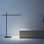
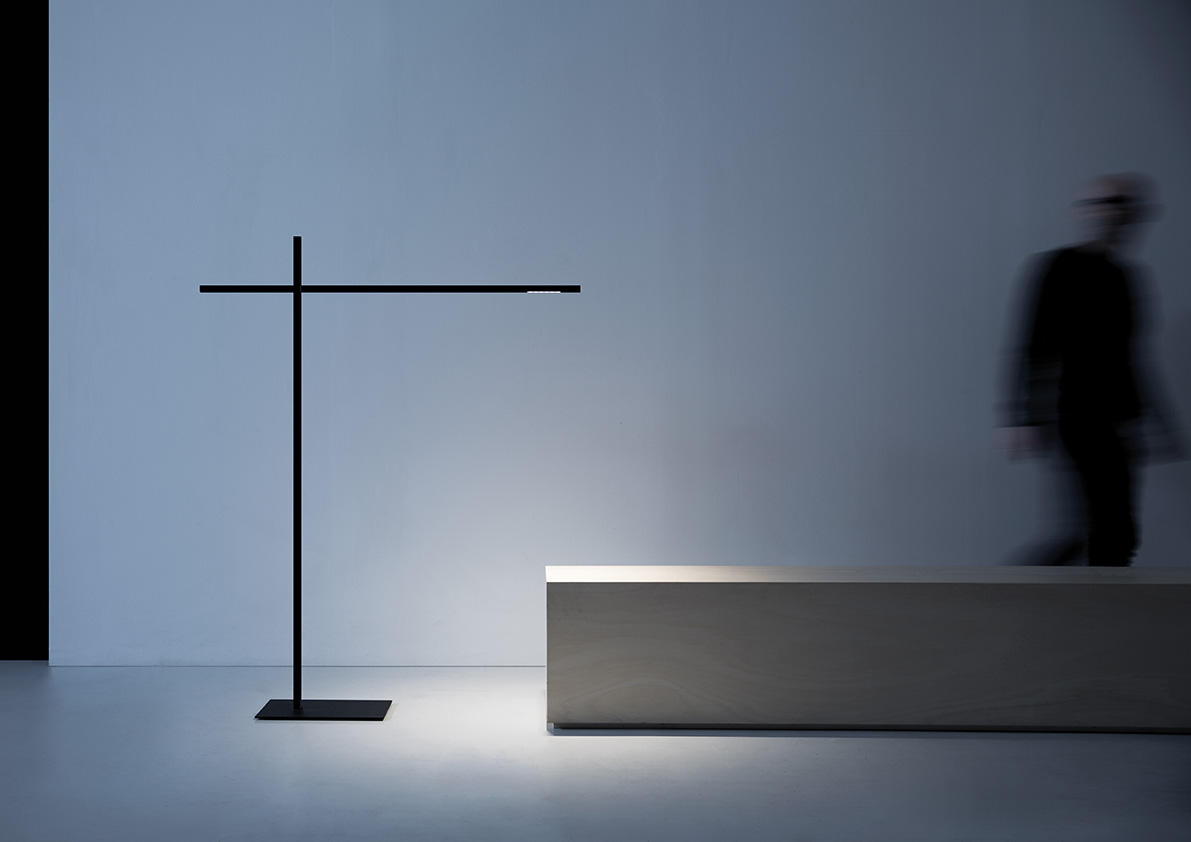
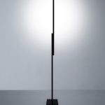
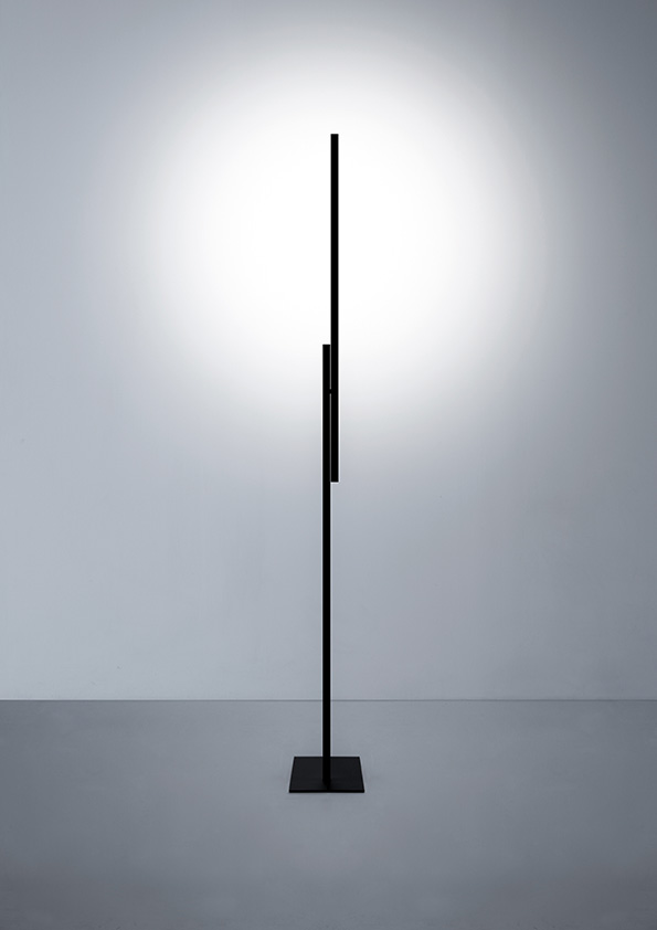
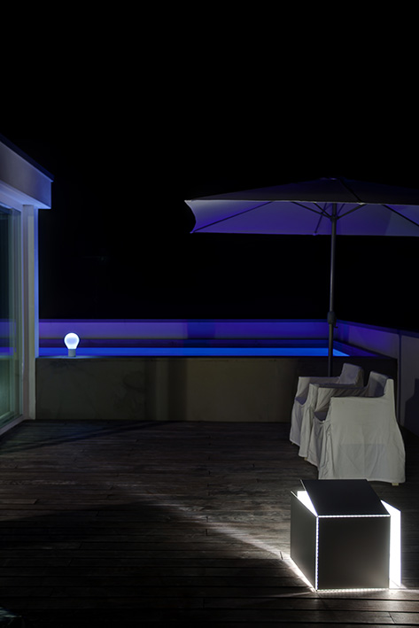
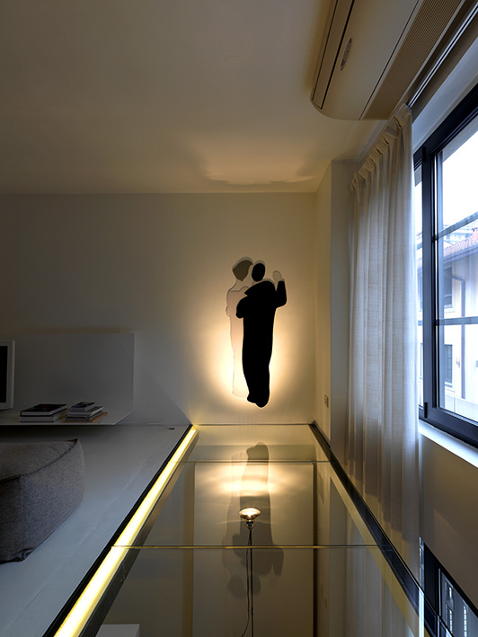
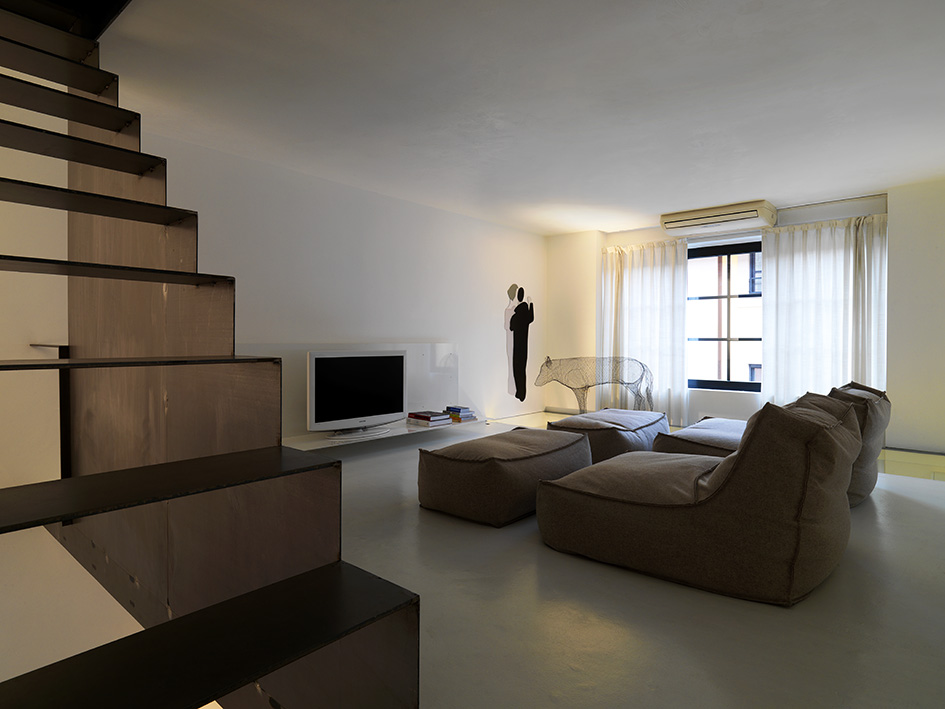
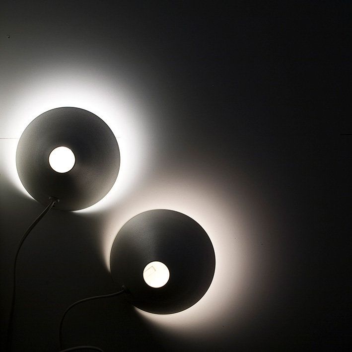
今回EUROLUCEで発表された、「HASHI」というプロダクトは、日本のお箸へのオマージュとして名付けたられたものです。(箸のもつ)軽快性や、クロスしながら生まれる叙情的な動きを、テーブルや天井、床、読書灯など様々な光を届けるのに、心地よい動きを作り出す為に考案したアイデアです。
このようにDavide Groppiに関しては特に強い結びつきのあるメーカーですが、それ以外にも光に対してのリサーチをしている会社として、FLOS、Foscarini、Lasvitなどが挙げられます。Lasvitは比較的新しい会社ですが、ガラスは光を届けるための手段として捉えていて、ガラスを使った彫刻だからこそ照らし出される光に注目しています。また、Artemide、Fontana Arte、NEMOなど大手のブランドは、独自のアイデンティティだけでなく、設計者の観点から建築照明として、独自の路線を探っていると感じています。
-
- HASHI
-
- HASHI
-

- HASHI
– Is there any company you are particularly interested in?
Based on my experience over the last ten years, I have been collaborating with Davide Groppi and his company, which he established thirty years ago, and we have gradually developed together some projects. He is also the owner of the company as well as the art director. It is important for me to keep a positive relationship with him.
The reason why I am keen on Davide Groppi is first of all he has a coherent aesthetic and clear understanding of how to communicate light to people – it is not just a decorative aspect or its image, it is to focus the light itself and to regard the lighting product as a source for providing continuous light. Having designed lighting product as an architect, it is quite natural for me to collaborate with them on my project.
HASHI, a project, newly announced on EUROLUCE, is an homage to chopsticks, especially those used in Japan. I had an idea to express its lightness or poetic gesture in order to introduce pleasant light for table, sealing, floor and reading in various ways.
As you see, I have a strong relationship with Davide Gropppi but I would also like to mention other companies such as FLOS, Foscarini and Lasvit as manufacturers who have been researching light. Especially Lasvit, they are still new but developing their own style to create light produced through sculpture in glass. I think Major brands such as Artemide, Fontana Arte or NEMO are trying to build up a course on their own, not just to find their identity but to develop architectural lighting.
– HASHIをデザインされた事についてもう少しお話を伺わせて下さい。ポエティックな観点と、もう一つの観点としてはLED光源の台頭がデザインを完成させているのではないでしょうか。電球では実現できなかった世界をLEDの台頭でその幅を広げていますが、LEDへの可能性をどのように見いだしていますか?
もはやLEDは、どの企業にとっても基本の技術となり、それぞれが各プロダクトをLED技術で開発し、適応させることでマーケットを動かしています。また、更なるイノベーションで光源が小さくなり、温度管理もし易く、器具を小さくすることも可能になりました。まさにミニマムなサイズで実現されたHASHIは、25×25mmの小さなチップモジュールを採用する事で実現できたもので、電球では実現できませんでした。
Davide Groppiの「INFINITO」はミニマルな光の表現で、白熱灯に近い魔法のような効果を導く事ができる大きな技術発明であり、光の世界を一変させました。各企業も、そのイノベーションに対し大きな投資をしながら、技術的な「光の味覚」を変遷させており、とても面白い時期だと感じています。様々な進化がみられるので、これからも益々面白い動きになると思います。
-
- INFINITO
– May I ask you little bit more about HASHI? I think there are two aspects of HASHI’s creation, one is poetic expression and other is the rise of LED light sources which expand the possibility of lighting market where light bulb could not. What do you think about future of LED?
LED is now the standard technology for all lighting companies which create the LED products that are the main movement of the market. Further innovation also enables us to minimise light sources and the product, and make managing temperatures much easier. I was able to create HASHI, using a 25 x 25 mm tiny LED module. It was impossible to do this with a light bulb.
The world-changing lighting “INFINITO”, designed by Davide Groppi is the expression of minimal light and has an innovative technology giving us the effectiveness of a light bulb. I am positive about current trends in lighting markets. Each company has invested heavily in innovation to go through technical transition creating varieties of lighting.
– 以前、木漏れ日について、興味深いお話を聞かせていただきましたが、改めてお聞かせ下さい。
LED技術の面白い側面として、自ら光の特徴を作り出す事ができます。TRI-Rとのコラボレーションによって再現したのは、このスタジオに入り込んできている木漏れ日のように、自然光が木々の自然なフィルターを通した揺らぎのある光、つまり、自然な光を再現することができることです。自分のスタジオに降り注ぐ「この時間の光」を人工的に生み出すことができる。挑戦的ではありますが、ある特定の状況を再現することができるのがLEDの技術革新です。
LGはOLEDを使い、トルトーナの展示会では光を制御して、自然の光の壁を作り出しました。これも、今まではできなかったことで、自分たちで光を生み出せる事が新しい可能性の一つだと思っています。
– I once heard your story of Komorebi (rays of sunlight through the trees). Could you tell me more about that?
One of the interesting aspects of LED technology is to be able to create characteristic light by itself. What I wanted to show in collaboration with TRI-R is the ability to recreate natural light, as if rays of sunlight through the trees. Well, this is exactly like what we actually feel right now in the studio! It can be challenging to generate a man-made object “the light right now”, but the technical invention of LED gives us the possibility of recreating some specific situation.
For example, LG created a wall of light under control and used OLED at the same time at the exhibition in Tortona. It was not actually possible up until now, one of the exciting new opportunities for us to be able to create light.
– 今回EUROLUCEを見ていて、私の感覚ですが「光を動かす」「光を操る」という事がキーワードだと解釈していますが、どのようにお考えですか?また、それを建築に入れ込む為にはどのようなアプローチになるのでしょうか??
その可能性を探るには、技術とユーザーとの間のインターフェースをデザインすることが必要です。光はモノ(照明器具など)を通して光らせることができるので、建築とどう連動させるのか?がポイントです。ライン形状であったり、レールを使いながら、線や面上に光らせたり、壁面の面積や天井高などとの関係性や、光の強さのコントロール機能なども含めて、光をデザインします。空間の環境を作るという観点で色々な組み合わせができないと提案できないため、点光源のスポットだけでは簡単に光の環境をつくることはできません。外の緑やカーテンを通して差し込む光、室内の家具やオブジェにあたって跳ね返る光などが重なり合うような、太陽の光が部屋に入り込んだ時に生まれるような、魅惑的な光を作り出すことは容易ではりませんが、直接光、間接光、集光、屈折、拡散などの光の効果が交わりあってこそ生まれる、複合的な光を考えなければならなりません。
– 私の意見としては、AIやIoTでコントロールできるテクノロジーが進んでいて、現状使うユーザーが追いついてきていない。ユーザーとの間にインターフェースが必要だということは、人の感覚だったり経験だったりするのでは?と思っているので、ご意見に同意です。
– From my point of view, the keywords of the EUROLUCE are “to move light” and “to control the light”, what do you think about that and how do you approach it in order to install these facts into architecture?
To find out the possibilities, it is absolutely necessary to design the interface between the user and technology. The light makes things bright, which is a point we need to consider when thinking how architecture can be coordinated with it. For instance, it can be lined or on the surface using rails. Considering the relationship between wall area and ceiling height, also the functionality of light control is also an important matter. It is actually not ideal to just use a point source of light in terms of creating the best environment for a space.
We need to take multiple lights into consideration to create dramatic effects by mixing different types of lights such as direct, indirect, condensed, reflected and diffused, though in spite of the difficulty of creating attractive light thrown from the curtains or bounced off the furniture or objects.
– I agree with your opinion. There is a need of an interface, because users can find it hard to use a developed technology that can be controlled by AI or IoT. Our natural sense or experience should perhaps be recognised more.
– 日本では「ミニマル」という言葉が商業的に使われていて、商品価値を後からつける付加価値のような使われ方をしていて、イタリアで感じるミニマルと相反すると感じています。
デザインの世界で、最も溢れている言葉がミニマルではないかと思いますが、その意味を理解することは重要です。私にとっては、モノが無いという絶対的な状況、モノの軽快性やサイズを極限まで極めること。それは建築空間の中で、例えば素材や機能、器具を使用する際にも、最低限必要なモノのみに絞られ、構造的、物理的バランスや制限、さらに機能性と美の間に生まれます。つまり、ミニマルとは、長いリサーチの中で、過剰なものをそぎ落としていく作業の結果と言えるでしょう。
特に、プロダクトにおいては顕著に現れますが、HASHIは最適なサイズを探る中で、25×25mmというLEDモジュールにたどり着きました。それを構造体に閉じ込め、継ぎ目を目に見えない形で実現し、これ以上小さくすることは不可能なレベルにまで仕上げました。
ここで注目する点は、機能的な制限から生まれたモノでありながら、必然的なスケールにたどり着いたのではないか?!とすら思されることです。これ以上小さくても軽すぎ、大きくては重すぎてしまう。まるで本来そうあるべきであったかのように、このサイズにおさまったのです。他の企業が真似するかもしれませんが、そこまで突き詰めてこのカタチに辿り着けるような繊細な感覚は持ち合わせていないのではないでしょうか。(HASHIにおいて)大切なのは、光自体を持ち歩けるプロダクトにすること、決してプロダクトを持ち歩くことを考えたのではありません。
ミニマルなエレメントは、決して邪魔をしません。まるで何かの徴(しるし)のように存在することができるのです。キッチンであれば、削り出された岩のような、純粋なエレメントであり形状をもちます。ミニマルとは、空の空間といえるでしょうか。詩的な空間でもあり、まさにそのものをあらわします。使われる空間であり、生活する空間そのものです。プロダクトであっても、建築や、インテリアデザインという観点からいうと、空の空間と例えることができます。軽快であり、時間をもたないものです。
イタリアでも日本のようにミニマルという言葉が乱用されていますが、本来は繊細性であったりライフスタイルそのものであったり、西洋からすると、ミニマルには日本の文化的な概念やコンセプトが含まれていると思います。軽快性、透明性、詩的で繊細な感覚。例えば、安藤忠雄氏の建築にはその特徴が表れているのではないでしょうか。TRI-Rのような太陽光を再現するという技術においても、このような文化背景が、反映された技術であると感じています。
例えば、西洋のフォークは4本の歯をもつのに対し、お箸の先は2本。これは、洗練させられたモノという解釈もできるのではないでしょうか?!
– Let me introduce a different subject. I have recently felt the word “minimal” is commercially overused, almost used as a ‘value-added’. I suppose this is the opposite in Italy?
Well I think “minimal” is the most “abuse” word in the creative market, and it is crucially important to understand what it is. To me, “minimal” means a situation of absolute nothing, and to attain utmost lightness or size. This is a particularly essential matter in an architectural environment, for example when we use some materials, function and equipment. It also suggests functionality and beauty, constructive or physical balance and limitation. In fact, “minimal” is a result of a process of reducing any excess in long-term research.
Especially it is noticeable in terms of product. For example, in the end HASHI reached its ideal size of LED which was 25 x 25mm. We made it as tiny as possible and took extra care for a joint to be invisible which actually made us think we might reach an exact size in spite of functional restrictions. It amazingly fit the size it should be. I don’t really think other companies possess the sensitivity to create a product like we did with HASHI. It should be emphasised that we carefully thought how to make the light portable rather than product.
Also any minimal element should never be disturbing. It could almost be like some symbol, even a completely pure feature such as scraped rocks. Minimal also means empty or poetic space and space itself to be lived and used. Product can even be exampled with empty space, lightness and something does not have time in terms of interior design or architecture.
The word ‘minimal’ is indeed overused in Italy too but I think it is originally connected to sensitivity or even lifestyle itself which also exists as a Japanese cultural concept. For example, Tadao Ando’s works typify lightness, poetic and a sensitive sense, especially from the perspective of Western culture. I suppose the technology of TRI-R (a technology that recreates the natural spectrum using a combination of cutting-edge LED technology) with a patented phosphor technology exactly reflects this kind of cultural background. Well, I might say because chopsticks only have two parts they are more sophisticated than a fork which has four prongs!
– 先ほどの話しの中で、拡散光というキーワードができてきましたが、OLEDをどのように評価していますか?
まだパフォーマンスが低いことに加え、光量が弱く、未知のプロダクトで使った事がありません。近年EUROLUCEへの出展企業も増えてきているし、建築的な照明以外にも意匠照明に適用できるのではないかと考えています。軽快性もあり、均一的な光を作り出せるところが面白い。
Davide Groppi氏と「光のカーテン」を作ってみたいと話しています。空間の仕切りとして、ただの壁ではなく、軽快な光のテクスチャーをもつ、透明な膜のようなプロダクトを作れるのではないかと。
大きな企業が投資している様子もうかがえるし、パフォーマンスがあがり日常でも使える状況になれば、これから非常に面白いエレメントになりうるでしょうし、新しい光の解釈ができるかもしれません。一方で、極端に軽快な光のエレメントでもあるため、数年後には装飾的な要素を求め、光源はごく小さいにもかかわらず、慣れ親しんだランプ形状が求められようになる可能性も考えられます。プロダクトには、ある程度の存在感が求められるという側面もあるためです。ファッションブランドが時代を繰り返すように、現代のようにテクノロジーが進み過ぎると、少し前に戻りつつ人類は、進化に対して、新しい文化を自分たちで確認するように、未知を探りながら進んで行くというある種の遊びが存在すると思うのです。音楽においてはレコード、写真においてはデジタルが進むとフィルムに戻ってみたりというように。
– As you mentioned earlier, I think diffused light is important. How do you rate OLED?
I’ve yet to try using OLED as its power is still quite low but it could possibly be applied to design light as well as architectural light. It has the benefit of creating an even light output.
I have also been discussing the possibility of making “a light curtain” with David Groppi. We might attempt to produce a transparent membrane product as a partition, not just as a wall.
Since large companies have invested in OLED, it could be high potential element if its quality develops and it is used in daily-life. On the other hand, people might prefer a feeling of nostalgia in future – it is likely that a light bulb shape could become popular again. We actually need a certain level of “presence” for a product. I think human beings in this high tech advanced world tend to look back on past physical media in order to evolve new culture such as using vinyl, for music, and film, for the photography industry.
– 今回のEUROLUCEの傾向として、ビビットな色ではなく、くすんだ色が増えたと思われるがなぜだと思いますか?個人的にはもしかしたら心理的な影響があるのではないか?と考えていて、人類はもっともっと自然を求めているのではないでしょうか?!
傾向としては素材の色を使うという方向性があると思います。常に木は使われますし、様々な金属を模した仕上げも使われます。例えば、真鍮やブロンズなどは、あたたかみがあり、過去の感覚や彫刻が持っている価値や重みを表現することができます。近年、樹脂が台頭し、屋外でも屋内でも非常に多用されてきましたが、完全に人工的なものであり、傾向としては終りつつあると感じています。今は自然によって作られた素材やそのものが持つ存在感に回帰している傾向にあり、金属であれば、比較的加工の簡単なアルミに対して、真鍮やブロンズなどは、それ自体の価値や加工の難しさとリンクするため、金属の仕上げは、企業がターゲットにしている顧客に対して、訴えやすく差別化しやすい価値でもあります。
– I personally thought there was a tendency towards using duller, more natural colours at EUROLUCE 2017 and this might be something to do with a psychological desire that we need more nature?
That is true. There is direction or movement to use the original colours of the material. For example, brass or bronze have warmth so these have been able to express value, importance of sculpture or feeling in the past. Resin has also frequently been used both inside as well as outside, however I think it is going to be less popular as it is perfectly artificial. Now we tend to choose materials from nature or present in the product itself. In contrast to aluminium which is easily processed, brass and bronze are not easily processed materials. That is why brazen and bronzed products appeal to the target clients.
– 本日デルロッソさんのお話を伺い、私自身なぜだろうか?と思っていた事が腑に落ちました。なぜ光に対して探究心や、それを感じるフィルターを持たれているのですか?光への気付きや、魅了されている理由など、光とのエピソードがあれば教えて下さい。
キャリア(建築家)の中での光への感覚は、徐々にインテリアデザインや照明器具をデザインするようになり、ユーザーがどのように使いこなすのかイメージし、光と向き合う必要から生まれました。建築に対し、室内に光をどのように届けるか?という点で、光と向き合う事から建築がスタートします。屋外からの光を室内に届けるために、開口部をどのようにとればよいか、窓は?など室内との関係を考えます。更に、光が無くなる時間帯には、光を作り出す必要が出てくる。つまり道具を使わなければなりません。
そこで、実験を繰り返しながら理解を重ね、マーケットの需要も合わせて考える中で、結果、照明器具というプロダクトが必要とする姿にたどり着きます。難しい部分としては、建築の中に組み込まれるプロダクトであるのに対し建築プロジェクトが存在するかなり前の段階でプロダクトの開発に向き合わなければならないことで、その場合、自身がそのプロダクトのユーザーでもある一方、メーカーがその後商品として販売していくことを考えると、最終顧客となるユーザーがどのように使うのだろうか?という観点からもフィジビリティを検討しながらデザインしなければなりません。
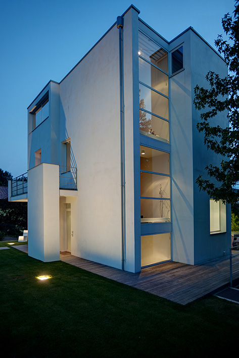
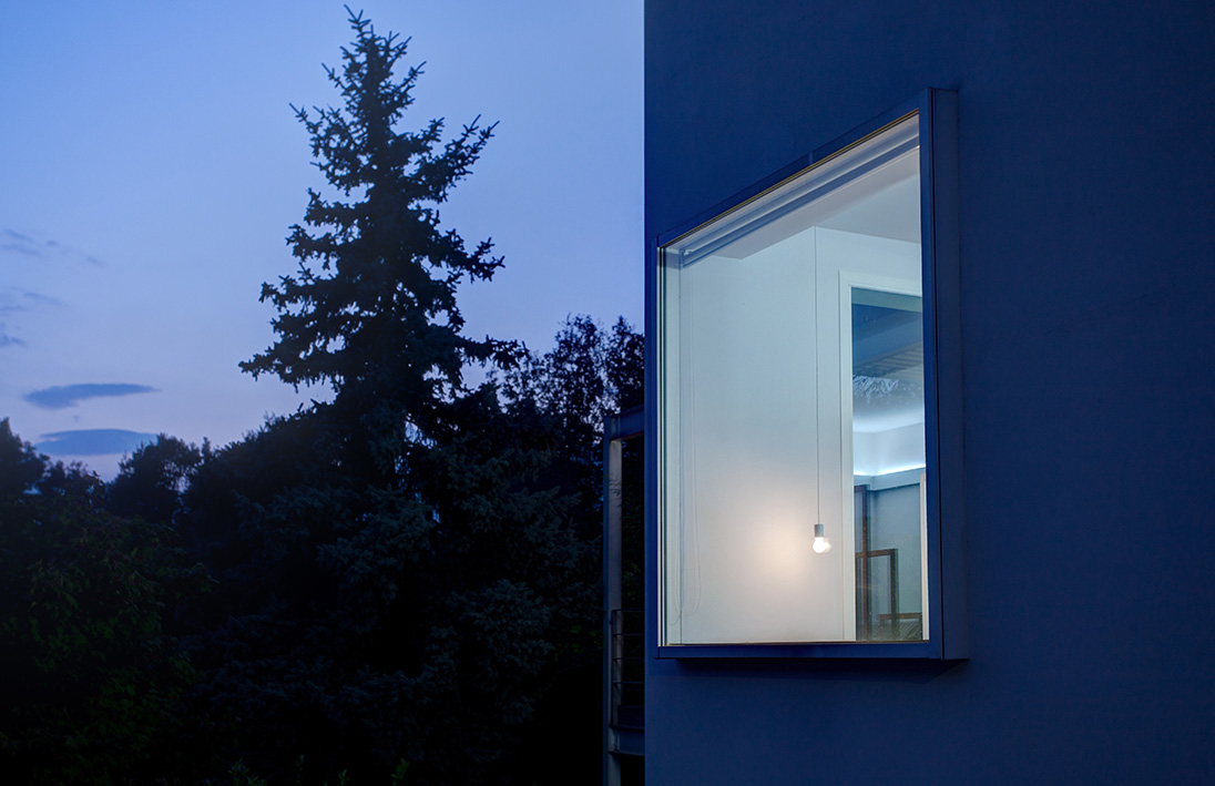
今日では、(現場で)電気設備を持ち歩いて試すこともできるため、はじめに光の位置を試し、その後システムを考えるという方法で光を試しながら、理想の光環境の実現に進めることもできます。最低限の数で優良な光を得るということ考える事は非常に難しく、計画において光は非常に本質的な位置を占めるものです。あまり光に大きな配慮を置かず、ライティングデザイナーに任せる方法をとる建築家もいますが、私としては、その方法は間違いだと思っています。光というテーマを知らずに設計を行うことはできないと考えているためです。自分(設計者)とは異なる視点や考え方をもつ別のデザイナーに、ライティングを任せることはできないと思うのです。もちろん、エレクトロニクスの観点から、技術サポートに関して、その分野のみを専門に手がける企業や専門家を巻き込むことはあり得ると思いますが、本来建築家のミッションは、プロジェクトに関わるすべての要素をコーディネートする役割があると考えているので、最も重要な要素の一つである光をなおざりにすることはできません。光に対するアイデアは、建築、空間の考え方を再確立してくれるものであり、空間の使い方においての機能と関わってくる要素でもあります。
– Today, I finally found an answer to something I’ve always been wondering about. So, where does your curiosity about light come from? I would like to hear your story about light – why are you so keen on it?
My sense of light has gradually developed over my career as an architect, especially since I started working on interior and lighting products. The more I’m involved with the light, the more I felt the importance of how it should be produced in an architectural environment. For instance, considering apertural area is important in terms of, or relation to, the inside of a room. It is essential to use a tool to produce light after sunset and then it becomes a lighting product as it should be, as a result of experiments and consideration of market needs. What makes it difficult is that for the timing and development of the product, we need to sort it far earlier before the project is being set up. In this case, we must be aware of feasibility and have a deep consideration of the whole situation – how the makers sell the product and how the end-users actually use it later on.
Electric equipment is portable so that we are able to try changing its position on site in various ways to create the ideal environment. It is extremely difficult to obtain good lighting with the minimal amount of light that should be essential in architectural planning. Some architects attach less importance to light and entrust everything to lighting designers, but I do not think that would be the right thing to do. I strongly believe that we are unable to work without wide knowledge of the light and prefer not to leave lighting work to other designers who have different opinions to mine even though I sometimes need support from electronic specialists. The architect’s mission is normally to coordinate all elements in the project so that it is impossible to ignore the light. This idea about the light makes us reconsider what architecture or space actually is.
2017.4.5 TOL STUDIO Interview
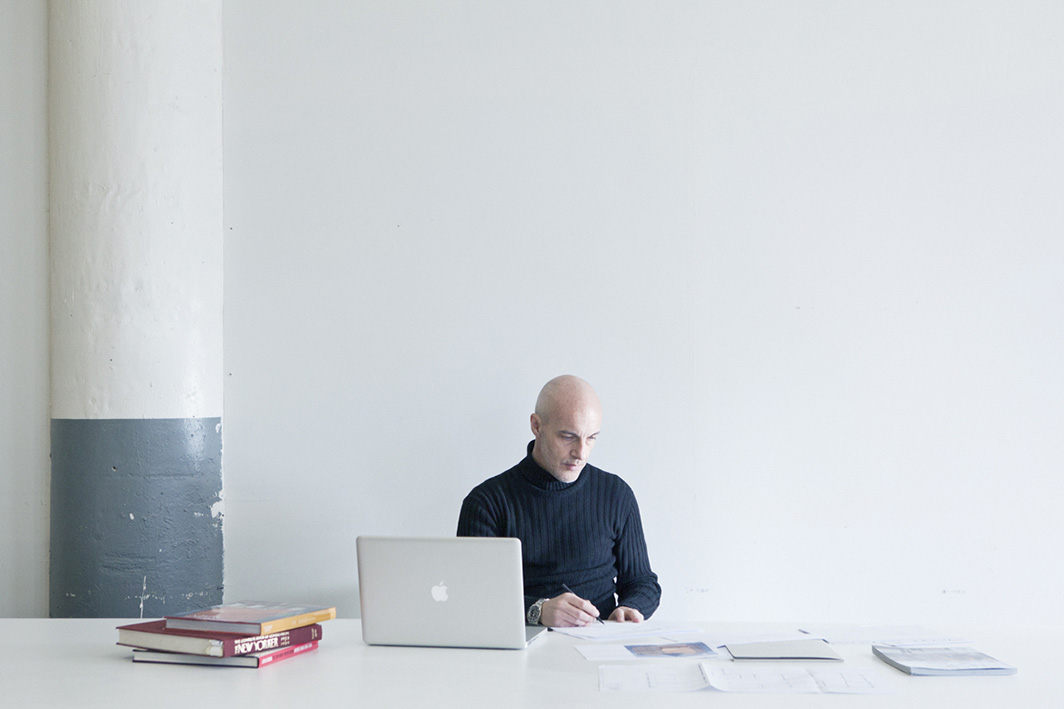

フェデリコ・デルロッソ氏(建築家) プロフィール
FEDERICO DELROSSO ARCHITECTS
1964年、イタリア・ビエッラ生まれ。
1996年にミラノ工科大学を卒業し、ビエッラで建築家としてのキャリアをスタート。
2004年、ミラノに「フェデリコ・デルロッソ建築事務所」を設立し、住宅、商業施設の設計、およびプロダクトデザインのプロジェクトを国際的に展開。2008年に手掛けた「Notime restaurant」は、アメリカのインテリアデザイン誌が主催する2012年度の「ベストイヤー賞」のファイナリストに選出。
2013年のAPIDA(アジア太平洋インテリアデザイン賞)や、2014年のユーラシア賞ロシアなどの審査員として国際的な名誉ある賞に招待。
建築を特別なものにするのは「建築」そのものではなく、自然や都市空間のように、そこに住む人々と空間との間に生まれる「想い」が引き起こす、まるで奇跡の術のようなものです。建築家の貢献とクライアントの期待が効果的に合致して、空間の細部に宿る魂が見えるとき、この微妙な均衡に達したときだけ、特別な建築が生まれることができます。そのような完璧だと言い切れるプロジェクトの解決策が見つかるとき、それは本当に幸福感にあふれる魔法の瞬間です。短くほんのわずかな時間だけ得られる本当に濃い瞬間、その興奮が私の仕事への重要な動機であり4つめの次元「感情的な四次元」であると言えます。
Federico Delrosso’s Profile
FEDERICO DELROSSO ARCHITECTS
Born in 1964 in Biella, Italy, Federico Delrosso graduated from Polytechnic University of Milan in 1996. While studying Architecture he started working with his father, a surveyor, experiencing various fields of design. In 1997 he began his career as an architect and in 2001 founded his own studio in Biella.
Three years later in 2004, Federico opened a new space in Milan, Federico Delrosso Architects, working in a very wide range of types of projects; residential, commercial and product design, and expanding his expertise internationally with his team. His early experience in the field has consolidated a talent and a distinctive sensibility for spaces perceived in his projects as an intangible quality, which Federico Delrosso calls “the emotional fourth dimension”. In his interiors as well as in his architectural projects, the masterful relationship between three-dimensional spaces and the elaboration of surfaces results in a sense of pleasant balance, a typical element found in fine architecture.
The project for his own studio in Milan has been selected in 2012 as one of the finalists of the prestigious “Best of the Year Award” organized by the American Interior Design magazine as was the Notime restaurant interiors in Montecarlo, Monaco in 2008. Federico Delrosso expands his presence in the United States in 2012 by opening two reference points in Miami and in New York. In 2014 he has been nominated as inaugural member of the IIDA (International Interior Design Association) of Chicago which selected Federico Delrosso as member of jury of its Global Excellence Awards 2015.
Federico Delrosso is frequently invited to international prestigious awards as member of jury, such as APIDA Asia Pacific Interior Design Awards in 2013 and Eurasian Prize Russia in 2014, and to design conferences around the world to be part of the main speakers.
His first monograph “Pushing the Boundaries” has been published by Skira in 2013. Same year during Dining by Design in New York, Federico presented Dining Tank. In 2014 he was invited to Mexico City as a main speaker at the ELA’ / EDI Expo Design Interiorismo where he held a conference with the title “Moving the Boundaries” and unveiled “Domus Mediterranea”, a new concept of single-family home.
In the same year he took part of the Biennale of Architecture in Moscow and in Ecuador where he gave lectures with the title “Light and Architecture”. Later in 2015 he has been one of the guests at Leaders in Design MENA in Dubai.
Design
Federico Delrosso designed important furniture and lighting collections for various Italian companies, including Henry Timi and Davide Groppi.
Moebius collection (Henry Timi) and Palpebra lamp (Davide Groppi) are amongst the finalists of the Best of Year Awards by Interior Design magazine (USA).
Mima lamp (2007, for Davide Groppi) entered the 21st Compasso d’Oro in 2008 and has been added to the ADI’s historical collection.
Federico Delrosso designed Cinquanta collection for Doğtaş Mobilya in 2011, a major furniture manufacturer in the Middle East region.
In 2013 Federico conceived Slim35mm, a new material for Tabu and the set design for the company during Made Expo 2013 in Milan. Using marmocode, an innovative material he developed assembling the scraps of marble production, Federico designed the tableware collection fd802 for Henry Timi.